Data Analysis and Probability - Part 1: Graph, Frequency and Histograms, Data Distributions, Independent and Dependent Events

This time, the reference comes from Holt McDougal's Algebra 1 textbook. The final chapter, Chapter 10, covers Data Analysis and Probability. This is a great book. I recommend that you read this book.
Most of the content of this book is similar to Algebra 1: Parts 1, 2, and 3. The special one in this book, I think, is having a chapter that covers Data Analysis and Probability.
I created a summary or short of chapter 10 of the book. It may not be perfect, in my opinion, due to the lack of some examples. But it covers all the points of the chapter. Some of this content also includes content from ChatGPT and Gemini.
Bar, Pie, and Line Graph
Bar Graph
The graph above is an example of a bar graph.
A bar graph is a graph that displays categorical data using rectangular bars, where the length or height of each bar represents the value or frequency of that category. Bar charts can be vertical (most common) and horizontal (useful when category names are long).
Pie Graph
The graph above is an example of a pie graph.
A pie graph is a circular graph used to show how a whole is divided into parts. Each slice of the pie represents a category, and the size of each slice shows its proportion or percentage of the total. The entire circle represents 100% of the data. You should choose a pie graph when your goal is to show parts of a whole, not to compare exact values.
Line Graph
The graph above is an example of a line graph.
A line graph is a graph that displays data points connected by straight line segments to show how a quantity changes over time or over a continuous variable. The horizontal axis (x-axis) usually represents time or another continuous variable. The vertical axis (y-axis) represents the measured value. Each point shows a value at a specific moment, and the line highlights the trend or pattern. You should choose a line graph when your main goal is to show change, trends, or movement.
Frequency and Histograms
Frequency refers to how often a value or range of values appears in a data set, while a histogram is a graph that displays these frequencies for continuous numerical data. In a histogram, data are grouped into intervals called bins, and adjacent bars show the frequency of values within each interval, with no gaps between bars. Histograms help reveal the shape of a data distribution and are especially useful for understanding patterns in large data sets rather than focusing on individual data points.
Here is an example.
The final scores for each golfer in a tournament are given below.
77, 71, 70, 82, 75, 76, 72, 70, 77, 74, 71, 75, 68, 72, 75, 74.
Here is the frequency table with intervals based on the data above.
| Golf Tournament Scores | |
|---|---|
| Scores | Frequency |
| 68-70 | 3 |
| 71-73 | 4 |
| 74-76 | 6 |
| 77-79 | 2 |
| 80-82 | 1 |
Here is the histogram based on the table above.
Cumulative Frequency
Cumulative frequency is the running total of frequencies as you move through a data set in order, usually from the smallest values to the largest. Instead of showing how many times each individual value or interval occurs, cumulative frequency shows how many data points are less than or equal to a given value or class boundary.
Here is an example.
The heights in inches of the players on a school basketball team are given below.
72, 68, 71, 70, 69, 79, 76, 72, 75, 72, 74, 68, 70, 69, 75, 72, 71, 73, 76
| Basketball Players' Heights | ||
|---|---|---|
| Height (inch) | Frequency | Cumulative Frequency |
| 68-70 | 6 | 6 |
| 71-73 | 8 | 14 |
| 74-76 | 5 | 19 |
| 77-79 | 1 | 20 |
Stem-and-leaf Plot
A stem-and-leaf plot is a way to organize and display numerical data that preserves the original values while showing their overall distribution. Each number is split into a stem (the leading digit or digits) and a leaf (the last digit), where the stems are listed in order and the leaves are written beside them. This makes it easy to see patterns such as the shape of the data, clusters, gaps, and the range, while still allowing you to read the exact data values. Stem-and-leaf plots are especially useful for small to moderate data sets when you want both a visual summary and the raw numbers at the same time.
Here are examples.
-
The numbers of students in each of the elective classes at a school are given below. Use the data to make a stem-and-leaf plot.
24, 14, 12, 25, 32, 18, 23, 24, 9, 18, 34, 28, 24, 27.
Number of Students in Elective Classes
Stem Leaves 0 9 1 2 4 8 8 2 3 4 4 4 5 7 8 3 2 4 Key: 2|3 means 23.
-
Marty's and Bill's scores for ten games of bowling are given below. Use the data to make a back-to-back stem-and-leaf plot.
Marty: 127, 149, 167, 134, 121, 127, 143, 123, 168, 162.
Bill: 129, 138, 141, 124, 139, 160, 149, 145, 128, 130.
Bowling Scores
Marty Bill 7 3 1 12 4 8 9 7 4 13 0 8 9 9 3 14 1 5 9 15 8 7 2 16 0 Key: |14|1 means 141, 3|14| means 143.
Data Distributions
A measure of central tendency describes the center of a set of data. Measures of central tendency include the mean, mediam, and mode.
- The mean is the average of the data values, or the sum of the values in the set divided by the number of values in the set.
- The median is the middle value when the values are in numerical order, or the mean of the two middle numbers if there are an even number of values.
- The mode is the value of values that occur most often. A data set may have one mode or more than one mode. If no value occurs more often than another, the data set has no mode.
The range of a set of data is the difference between the greatest and least values in the set. The range is one measure of the spread of a data set.
Here is an example.
The numbers of hours Isaac did homework on six days are 3, 8, 4, 6, 5, and 4. Find the mean, median, mode, and range of the data set.
mean: \(\Large \frac{3 + 4 + 4 + 5 + 6 + 8}{6} = \frac{30}{6} = 5\)
median: There is an even numbers of values (4 and 5). We need to find the mean of the two middle values. \(\Large \frac{4 + 5}{2} = \frac{9}{2} = 4.5\)
mode: 4 (4 occurs more than any other value.)
range: 8 - 3 = 5 (Subtract the least value from the greatest value.)
Outlier
An outlier is a data value that lies far away from most of the other values in a data set, making it noticeably different from the overall pattern. Outliers can occur due to measurement errors, data entry mistakes, or genuine unusual observations. They are important to identify because they can strongly affect summary statistics such as the mean and can influence the interpretation of data distributions, trends, and conclusions.
Here is an example for the data of 5, 7, 8, 9, 10, 12, and 54.
| Statistic | With Outlier (5, 7, 8, 9, 10, 12, 54) |
Without Outlier (5, 7, 8, 9, 10, 12) |
|---|---|---|
| Mean | 15 | 8.5 |
| Median | 9 | 8.5 |
| Mode | None | None |
| Range | 49 | 7 |
Quartiles
Quartiles divide a data set into four equal parts. Each quartile contains one-fourth of the values in the set. The first quartile is the median of the lower half of the data set. The second quartile is the median of the data set, and the third quartile is the median of the upper half of the data set.
The interquartile range (IQR) of a data set is the difference between the third and first quartiles. It represents the range of th emiddle half of the data.
| Range: 9 - 1 = 8 | ||||||||||||||
|---|---|---|---|---|---|---|---|---|---|---|---|---|---|---|
| IQR: 7 - 3 = 4 | ||||||||||||||
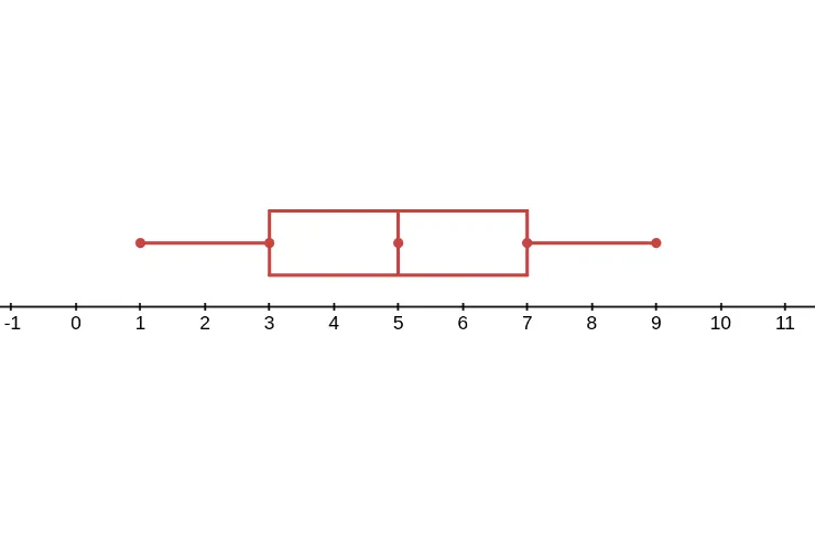
| 1 | 2 | 2 | 3 | 3 | 4 | 4 | 5 | 6 | 6 | 7 | 7 | 8 | 8 | 9 |
| First quartile (Q1): 3 | Median (Q2): 5 | Third quartile (Q3): 7 | ||||||||||||
Box-and-Whisker Plot
A box-and-whisker plot can be used to show how the values in a data set are distributed. You need five values to make a box-and-whisker plot: the minimum (or least value), first quartile, median, third quartile, and maximum (or greatest value).
Here is an example of a box-and-whisker plot based on the data above.
Dot Plots and Distributions
A dot plot is a data representation that uses a number line and x's, dots, or other symbols to show frequency. Dot plots are sometimes called line plots.
Types of Distributions
A dot plot gives a visual representation of the distribution, or "shape", of the data. Here are the types of distributions of dot plots.
Uniform Distribution
In a uniform distribution, all data points have an approximately equal frequency.
Symmetric Distribution
In a symmetric distribution, a vertical line can be drawn and the result is a graph divided in two parts that are approximate mirror images of each other.
Skewed Distribution
In a skewed distribution, the data is not uniform or symmetric. The data may be skewed to the right or skewed to the left.
Sampling and Bias
If you wanted to collect data about a very large group of people, you would most likely need to survey a smaller group. The large group that contains all the people you could survey is called a population. The smaller group is called a sample.
| Random Samples | ||
|---|---|---|
| Type | Definition | Example |
| Simple Random Sample | Every member of the population has an equal change of being chosen for the sample. | The names of all students in your class are placed in a hat and three names are chosen at random. |
| Stratified Random Sample | The population is divided into similar groups. Then a simple random sample is chosen from each group. | Your class is divided into boys and girls and two students are chosen at random from each group. |
| Systematic Random Sample | A member of the population is chosen for the sample at a regular interval. | Every third student who comes into the classroom is chosen. |
A random sample is not biased because no part of the population is favored over another. In a biased sample, one or more parts of the population have an advantage for being chosen for the sample.
There are two main types of biased samples.
| Biased Samples | ||
|---|---|---|
| Type | Definition | Example |
| Convenience Sample | Those members of the population that are easily accessed are chosen for the sample. | A reporter questions people he personally knows. |
| Voluntary Response Sample | Members of the population who want to participate make up the sample. | A reporter questions people who fill out comment cards and indicate that they would like to be contacted. |
Probability
Experimental Probability
An experiment is an activity involving change. Each repetition or observation of an experiment is a trial, and each possible result is an outcome. The sample space of an experiment is the set of all possible outcomes.
| Experiment | Rolling a number cube | Tossing a coin |
|---|---|---|
| Sample Space | 1, 2, 3, 4, 5, 6 | heads, tails |
An event is an outcome or set of outcomes in an experiment. Probability is the measure of how likely an event is to occur. Probabilities are written as fractions or decimals from 0 to 1, or as percents from 0% to 100%.
| Impossible | Unlikely | As likely as not | Likely | Certain |
|---|---|---|---|---|
| 0% | 50% | 100% | ||
| Events with a probability of 0% never happen. | Events with a probability of 50% have the same change of happening as not. | Events with a probability of 100% always happen. |
You can estimate the probability of an event by performing an experiment. The experimental probability of an event is the ratio of the number of times the event occurs to the number of trials. The more trials performed, the more accurate the estimate is likely to be.
\[\text{experimental probability} = \frac{\text{number of times the event occurs}}{\text{number of trials}}\]
You can use experimental probability to make predictions. A prediction is an estimate or guess about something that has not yet happened.
Here is an example.
A manufacturer inspects 800 light bulbs and finds that 796 of them have no defects.
-
What is the experimental probability that a light bulb chosen at random has no defects?
Find the experimental probability that a light bulb has no defects.
\(\Large \frac{\text{number of times the event occurs}}{\text{number of trials}} = \frac{796}{800} = 99.5\%\)
The experimental probability that a light bulb has no defects is 99.5%.
-
The manufacturer sent a shipment of 2400 light bulbs to a retail store. Predict the number of light bulbs in the shipment that are likely to have no defects.
Find 99.5% of 2400.
0.995(2400) = 2388
The manufacturer predicts that 2388 light bulbs have no defects.
Theoretical Probability
The theoretical probability of an event is the ratio of the number of ways the event can occur to the total number of equally likely outcomes.
\[\text{theoretical probability} = \frac{\text{number of ways the event can occur}}{\text{total number of equally likely outcomes}}\]
An experiment in which all outcomes are equally likely is said to be fair. You can usually assume that experiments involving coins an dnumber cubes are fair.
When you toss a coin, there are two possible outcomes, heads or tails. The table below shows the theoretical probabilities and experimental results of tossing a coin in 10 times.
| P(heads) | P(tails) | P(heads) + P(tails) | |
|---|---|---|---|
| Experimental Probability | \(\frac{3}{10}\) | \(\frac{7}{10}\) | \(\frac{3}{10} + \frac{7}{10} = \frac{10}{10} = 1\) |
| Theoretical Probability | \(\frac{1}{2}\) | \(\frac{1}{2}\) | \(\frac{1}{2} + \frac{1}{2} = \frac{2}{2} = 1\) |
The sum of the probability of heads and the probability of tails is 1, or 100%. This is because it is certain that one of the two outcomes will always occur.
\[\text{P(event happening)} + \text{P(event not happening)} = 1\]
The complement of an event is all the outcomes in the sample space that are not included in the event. The sume of the probabilities of an event and its complement is 1, or 100%, because the event will either happen or not happen. Two events are complementary events if the sum of their probabilities equals 1 and if one event occurs if and only if the other does not.
\[\text{P(event)} + \text{P(complement of event)} = 1\]
Odds are another way to indicate the likelihood of an event. Odds express likelihood by comparing the number of ways an event can happen to the number of ways an event can fail to happen. The odds in favor of an event describe the likelihood that the event will occur. The odds against an event describe the likelihood that the event will not occur.
Odds are usually written with a colon in the form a:b, but can also be written as a to b or \(\Large \frac{a}{b}\).
\[\text{odds in favor} = \frac{\text{number of ways an event can happen}}{\text{number of ways an event can fail to happen}} = a:b\]
\[\text{odds against} = \frac{\text{number of ways an event can fail to happen}}{\text{number of ways an event can happen}} = b:a\]
\(a\) represents the number of ways an event can occur.
\(b\) represents the number of ways an event can fail to occur.
The two numbers given as the odds will add up to the total number of possible outcomes. You can use this relationship to convert between odds and probabilities.
Independent and Dependent Events
Events are independent events if the occurrence of one event does not affect the probability of the other. Events are dependent events if the occurrence of one event does affect the probability of the other.
Here is an example.
Tell whether each set of events is independent or dependent. Explain your answer.
-
A dime lands heads up and a nickel lands heads up.
The result of tossing a dime does not affect the result of tossing a nickel, so the events are independent.
-
You choose a colored game piece in a board game, and then your sister picks another color.
Your sister cannot pick the same color you picked, and there are fewer game pieces for your sister to choose from after you choose, so the events are dependent.
To determine the probability of two independent events, multiply the probabilities of the two events.
If \(A\) and \(B\) are independent events, then \(P(A \text{ and } B) = P(A) \cdot P(B)\).
To determine the probability of two dependent events, multiply the probability of the first event times the probability of the second event after the first event has occurred.
If \(A\) and \(B\) are dependent events, then \(P(A \text{ and } B) = P(A) \cdot P(B \text{ after } A)\).
Related Articles
- Algebra 2 - Part 3: Function Transformations, Equations, Trigonometry, and Modeling
- Algebra 2 - Part 2: Polynomial Graphs, Rational Exponents and Radicals, Exponential Models, and Logarithms
- Algebra 2 - Part 1: Complex Number, Polynomial Arithmetic, Polynomial Factorization, and Geometric Series
- Algebra 1 - Part 3: Polynomials, Quadratic Equations, Parabola, Vertex, and Irrational Numbers
- Algebra 1 - Part 2: Functions, Sequences, Graph with Absolute Value, Simplifying Square Roots, Exponential Growth and Decay